1. Color Isn’t Just Decoration — It’s Emotion
Color is one of the fastest ways to trigger an emotional response. Before we read, analyze, or even consciously notice a design, we feel it.
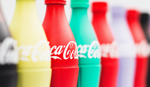
- Red evokes energy, urgency, and passion — used by brands like Coca-Cola or Supreme.
- Blue conveys trust, calmness, and professionalism — think of PayPal or IBM.
- Yellow suggests optimism and youth — McDonald's and Snapchat use it to spark joy.
- Black signals luxury and power — favored by Chanel and Nike.
- Green leans into nature, balance, or finance — Whole Foods and Spotify use it to their advantage.
But beware: color psychology isn’t universal. Cultural context matters. White may signal purity in Western cultures but mourning in parts of Asia. That’s why global brands localize colors carefully
2. Typography Sets the Tone — Literally
Fonts aren't neutral. The moment you see them, your brain makes assumptions about the brand.
- Serif fonts (like Times New Roman or Georgia) feel traditional, trustworthy, and intellectual. Law firms, universities, and heritage brands lean here.
- Sans-serif fonts (like Helvetica or Futura) feel clean, modern, and approachable — perfect for tech companies and startups.
- Script fonts suggest elegance and femininity — often used in luxury or beauty branding.
- Monospaced fonts (like Courier) can feel mechanical or retro — great for developer tools or nostalgic branding.
Even small differences — like spacing, weight, and roundness — shape perception. A slightly rounded sans-serif feels more friendly. A condensed typeface can feel bold but aggressive.
3. Consistency = Recognition = Trust
Think of your favorite brands. You could probably recognize them by color or font alone — even with the logo blurred out. That’s not accidental. That’s consistency in visual language.When color and typography are used consistently across every touchpoint — website, packaging, social media, ads — they create a cohesive brand experience. This leads to:
- Recognition: Your brand becomes instantly identifiable in a crowded feed.
- Familiarity: Repeated exposure builds emotional connection.
- Trust: A polished, consistent brand feels reliable and intentional.
4. Design = Differentiation
In markets flooded with similar offerings, how do you stand out? Often, it’s not the product — it’s the brand identity.
Take banks, for example. They offer nearly identical services. But why does someone choose Monzo over HSBC? Why does Revolut feel more modern and tech-driven? Often, it comes down to visual identity — the colors, fonts, and design language that align with a user’s values and personality.Typography and color don’t just decorate the brand — they define its voice.
5. The Subconscious Works Fast
Studies show people form a first impression within 50 milliseconds of seeing a website or ad. That’s faster than you can blink.
At that speed, people aren’t reading your pitch or checking your price — they’re feeling the vibe. Is this brand trustworthy? Trendy? Serious? Sustainable? Premium? Fun?That’s the power of the unseen language. It bypasses logic and goes straight to emotion.
Final Thoughts
Color and typography aren’t just creative choices — they’re strategic tools. Used intentionally, they can build emotional resonance, create instant recognition, and carve out a unique identity in a noisy market.
So next time you choose a font or tweak a brand palette, ask yourself:
What is this saying — without saying a word?
Because whether you know it or not, your brand is always speaking.